So lately I've not been liking my UI too much. The two chat boxes, one for chat and another for system and battle stuff was great, but having them stacked over on the left really ruined my peripheral vision over there. This is because of needing to use the log transparency feature to actually be able to read anything in these boxes 80% of the time.
So instead I've tried moving them both to the bottom like this.
Attachment:
File comment: UI v2
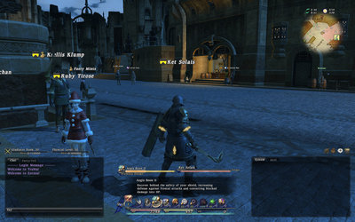 ui2.jpg [ 323.14 KiB | Viewed 1768 times ]
Might take a little getting used to, since I need to look right for important information now instead of left, but we'll see how it goes.
What I'd like to do in future if SE let us customize the UI ourselves is:
1) Get all the action bars onto the screen at once. That scroll up down thing is super annoying.
1b) Set the action bars up in a way that mimics
my G510 keyboard keys.
2) Replace that crappy buffs/debuffs icon thing with a list. It's hard to tell what the icons mean when a lot of abilities use similar or the same icons and the countdowns are hard to read at a glance when you've got a whole line of them.
Ironically, I'd probably put both of these on the left, but that's because they'd only really be visible during battle. Since I was bored I mocked it up in Photoshop quickly. So it'd be something like this I guess:
Attachment:
File comment: UI v2 Photoshopped
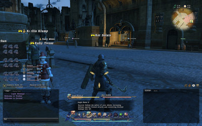 ui2b.jpg [ 330.75 KiB | Viewed 1768 times ]
Lets hope they really do let us make custom UIs in future. I'll learn the language and implement some of this stuff myself if I have to.